Celestial Kiss - logo explorations
Logo Example A
With this exploration, I wanted to combine the two elements from different font families, mixing the less formal “celestial”aspect, and the keeping a more serious tone towards the word “kiss”, playing with a bit more of a duality sentiment.
I also wanted to include a very minimal/subtle ray refference to the upper left corner, in order to play a little bit with negative space masking, cutting a little bit of the letter C. I had inspirations from slightly space themes, but very distant… and also rose thorn.

Logo Example B
For this idea, I wanted to concentrate a bit better the two words into a more unified block, still playing with the two ray/thorn points, interesecting and playing with a invisible mask, creating an interesting identity of a “meeting” between two energies, but not in a explicit way.
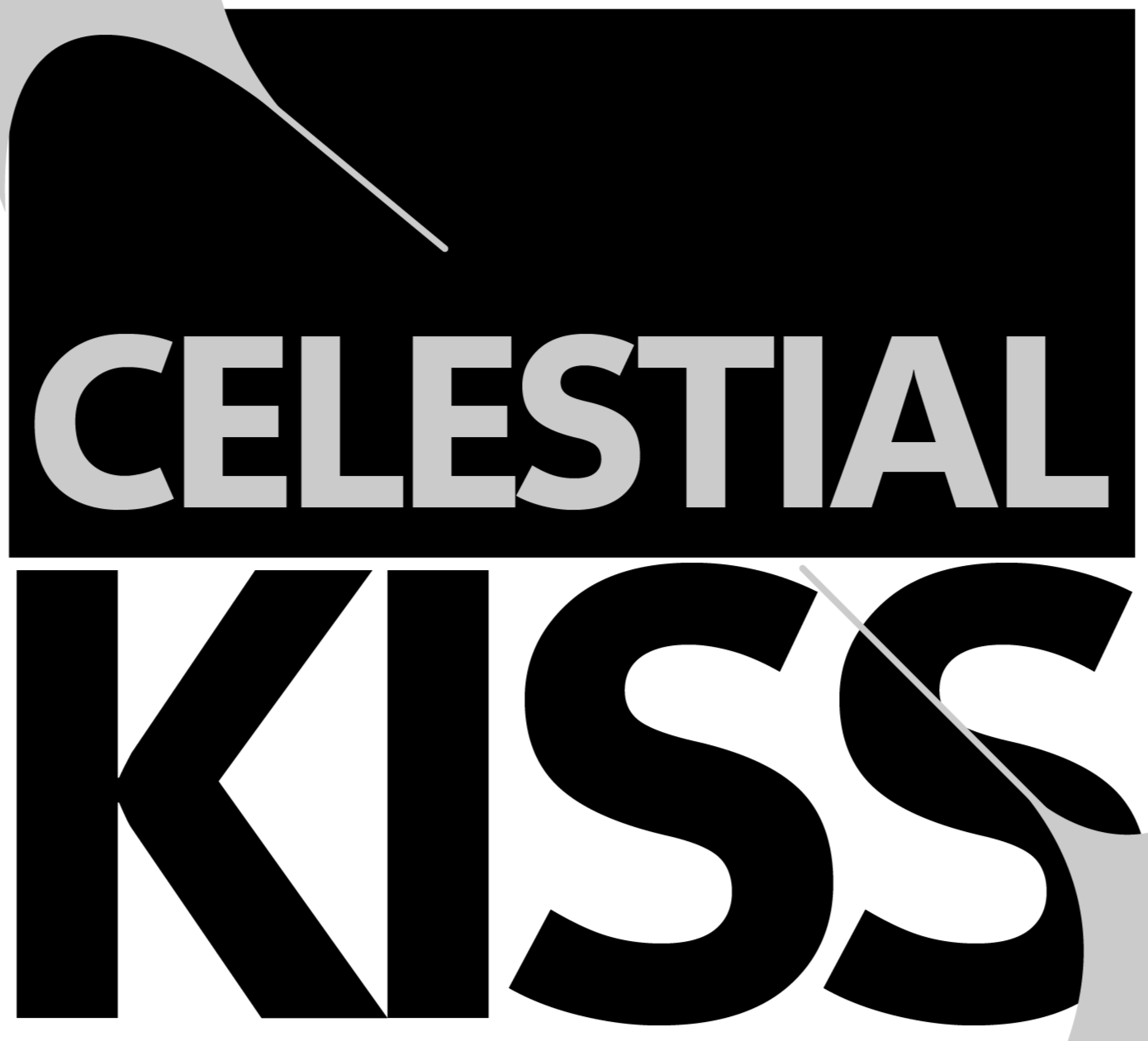
Logo Example C
For this idea, I kept the exploration of two different typefaces and widtht in order to explore a duality and different personality, but interesecting the letters is the thorn/laucher cut. This could be further explored by a different positioning and size of this thorn.

Logo Example D
A much cleaner look, still keeping the thorn/cuts, but this time just around the word “kiss”. I kept the even typeface as well, having a more simplified look, but that could work in several aplications, and could also be further explored by a different typeface, or contained inside a box, etc!

Logo Example E
This is just a very quick test, exploring the idea of the rose (inspired by the rose image on the songs page), but I wanted to further explore a better masking/negative space usage, not just outlines. But I thought it could be interesting to share it and see what would be the feeling of adapting a rose to the logo, maybe in a much more subtle way, etc.
I really like the rose image, that is why I thought it could be great somehow to adapt it.