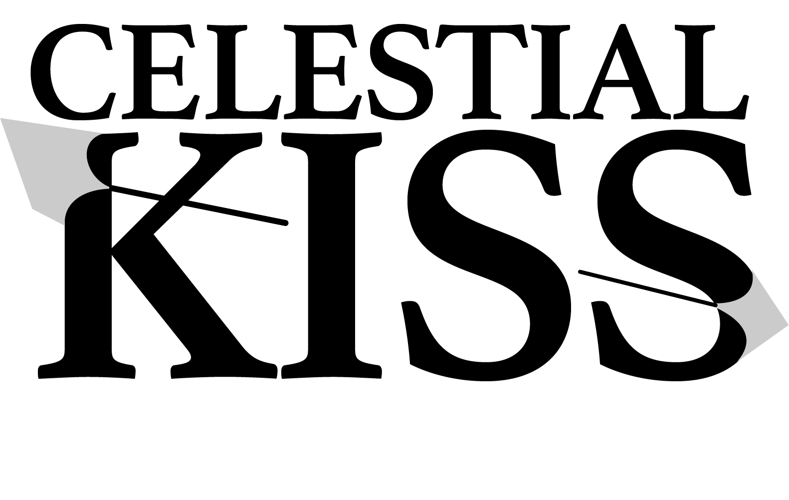
Celestial Kiss - logo explorations
Variation A
For this variation, I explored fully the idea of thorns, the sharp points have a taper effect, and there is a negative cut in the middle of the word KISS, keeping the continuity of the connection between thorns.
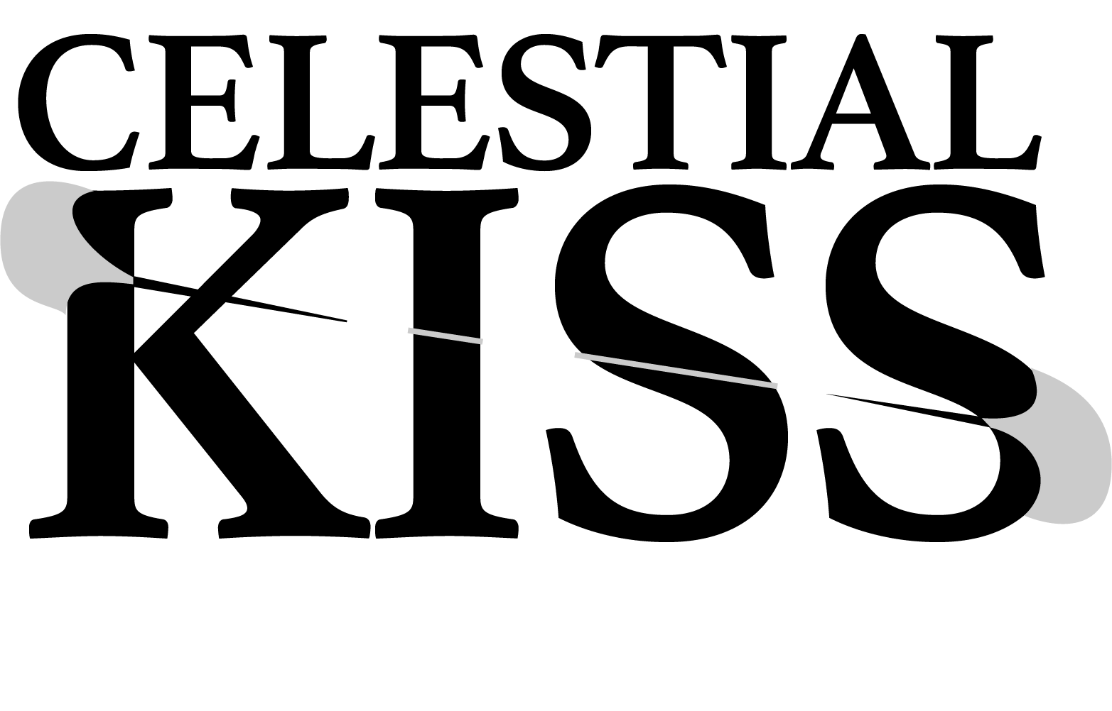
vARIATION B
This is a more geometrical/clean look, in fact, the thorns can be even reduced to a smaller line, but I thought that like this, we are keeping the two letters in the middle of the word kiss isolated, as if the thorns sharp points stopped just before it crossed everything.